Jump to content

IPBoard Styles©Fisana

Photo

I'm making a video game.


  • Please log in to reply
211 replies to this topic

#151 D~N

D~N

    just a humble polymath

  • Members
  • 3,200 posts
  • Gender:Male

Posted 03 December 2008 - 08:15 PM

Ahh I see. A few reasons I thought it was guitar - for one, I listened to the compressed midi, so I couldn't see the instruments. Also, with the midis, the quality changes a bit, so I was tricked. The cello is playing some epic notes, which tricked me even further. Regardless, I love what you've done here! I opened it up with finale finally, and man that just looks insane. That's a lot of work you put into this, so i appreciate it! It really turned out well! ^.^

EDIT: just caught your update. Excelent final touches! The ending lends itslef wonderfully to looping the song, which is imporant. It's tempting to want to end on that nice note, but looping is important in video game songs. Of course the looped version wont have the intro [where it goes up and down again] cause that's just a one-time deal to start off the battle, ya know? Again, fantastic job.

My only request is that the village theme be kept simple and peacefull. You can add stuff, certainly...but dont adjust the tempo or "feel" of the song. Keep it happy. :) I'm sure you'll do an outstanding job; if this last peice is any indication, you'll exceed every expectation!

Edited by D~N, 03 December 2008 - 08:26 PM.


#152 wisp

wisp

    Boobie Administrator

  • Admin
  • 14,042 posts
  • Location:in ur base killin ur mans
  • Gender:Knarrarbringa
  • South Georgia and the South Sandwich Islands

Posted 03 December 2008 - 09:33 PM

I'm trying to keep the texture a lot thinner on this one - fewer instruments playing at a time. I'm trying to give the whole thing a very legato feeling, and I'm thinking I might have to adjust some stuff on the parts where the marimba is playing the melody, because it's clashing with the mood of the music.

Edit: I changed mallets to celesta. Hopefully this will still give the pingy kind of sound while still blending well.

Another edit: The music for the village is sounding more heroic than I'd planned, but I really want to keep it like this, so if it's too much to use in a village, maybe you could use this somewhere else and we could come up with a new theme for the village? XD

It's obviously nowhere near finished, but this is what I've done so far tonight (holy crap it doesn't feel like it's been three hours already XD): http://rapidshare.co...llage2.MUS.html

I'm thinking of something more like this for the actual village: http://rapidshare.co...illage.MUS.html

Edited by wisp, 04 December 2008 - 01:34 AM.


#153 D~N

D~N

    just a humble polymath

  • Members
  • 3,200 posts
  • Gender:Male

Posted 04 December 2008 - 04:00 PM

Something you'll find interesting, I'm sure: the hometown of Khorel Village was once alarge rural town. However, the town was developed on a plate-fault. After centuries pass, the plate starts to open and a giant chasm starts to form. After a while, the rift grows so big that the towns become fully separated. When the game starts off, this one giant town actually acts like two sister towns. Oliver's hometown - Khorel - remained rural over the years, but the sister city developed and grew into a busier town. I think that in the spirit of being the "same town," it's logical for them to have the same theme. And yet, I feel like the busier town should have a busier theme.

I tell you all this because I think your first edit makes an excelent song for the sister town because it's a bit busier, and your most recent edit makes for a good rural-town-theme for obvous reasons. Both are great, and one can definitely see how both can be used for the respective towns.

#154 wisp

wisp

    Boobie Administrator

  • Admin
  • 14,042 posts
  • Location:in ur base killin ur mans
  • Gender:Knarrarbringa
  • South Georgia and the South Sandwich Islands

Posted 05 December 2008 - 12:44 AM

Well, great! :)

I'll finish them both, then. Do you have any suggestions for an ending, or do you want them to stay looped?

#155 D~N

D~N

    just a humble polymath

  • Members
  • 3,200 posts
  • Gender:Male

Posted 05 December 2008 - 03:54 PM

The ability to loop is ideal. Try to make the song end on a nice note and a note that can lead into the first note quite smoothly.

Writers, let's talk plot. I just wanted to know who's still on board as far as the writers go.

Artists; anyone that wishes to draw the antagonist Vladimir Savage, lemme know. He's easy to draw so basically I just need someone who likes to color. Ronald Marks probably wont need a re-illustration, but I'll throw it out there too. But before I upload the pictures I wanted to know if anyone was interested in such a task. So lemme know. :)

Edited by D~N, 05 December 2008 - 03:56 PM.


#156 wisp

wisp

    Boobie Administrator

  • Admin
  • 14,042 posts
  • Location:in ur base killin ur mans
  • Gender:Knarrarbringa
  • South Georgia and the South Sandwich Islands

Posted 10 December 2008 - 08:18 PM

I have a transcription of a Poulenc piano sonata that I had to do for my orchestration class - if you think it will fit anywhere in the game, I can take parts of it and reorchestrate them in a manner that's more suitable for a video game.

http://rapidshare.co...roject.MID.html

#157 D~N

D~N

    just a humble polymath

  • Members
  • 3,200 posts
  • Gender:Male

Posted 10 December 2008 - 09:03 PM

Oh! Very good stuff! It sounds like something I could play during

a) a battle, but perhaps not a major one. Something like a mini boss.
or
b) when Oliver is running through the woods in the beginning of the game. If has that panic feeling I think.

All in all, an interesting composition and I like it a lot!

#158 wisp

wisp

    Boobie Administrator

  • Admin
  • 14,042 posts
  • Location:in ur base killin ur mans
  • Gender:Knarrarbringa
  • South Georgia and the South Sandwich Islands

Posted 10 December 2008 - 09:31 PM

I think it fits running through the woods better than it fits a boss battle. There's too much legato for a boss battle IMO.

I'll see if I can find a complete score for it so that I can fix the ending - I just stuck in a chord at the end because the excerpt we were supposed to orchestrate for class stopped abruptly. So just be sure that you credit Francis Poulenc as well as wisp in the game if you use it. :P

Edited by wisp, 10 December 2008 - 09:32 PM.


#159 CID Farwin

CID Farwin

    Disciple

  • Members
  • 2,935 posts
  • Location:At the threshold
  • Gender:Male

Posted 09 January 2009 - 06:37 PM

I interrupt this prolonged hiatus to bring you the undisciplined art styles of yours truly.
Attached File  Ollie_and_Vlad.jpg   424.23K   34 downloads
I drew this up last semester (during class) and just now got around to posting it.

#160 SnowsilverKat

SnowsilverKat

    OMG ITS A SHINY PSYDUCK

  • Members
  • 1,570 posts
  • Location:The Nutmeg State
  • Gender:Female

Posted 14 January 2009 - 05:29 PM

CID, that's adorable!

...speaking of arts, I'll hopefully get around to coloring my contribution soon. I've been on an ink and color stint with some superhero characters from a tabletop RPG I'm in.

#161 wisp

wisp

    Boobie Administrator

  • Admin
  • 14,042 posts
  • Location:in ur base killin ur mans
  • Gender:Knarrarbringa
  • South Georgia and the South Sandwich Islands

Posted 14 January 2009 - 08:40 PM

Argh. I've been neglecting this over the holidays. I'll get back to it soon.

#162 D~N

D~N

    just a humble polymath

  • Members
  • 3,200 posts
  • Gender:Male

Posted 14 January 2009 - 08:49 PM

Nah it's alright, I understand. I was distracted over the holidays too, and now I'm busy with a lot of schoolwork. However, I'm making time to develop new locations. Recently I've completed the exterior of the southern half of Khorell's sister village, and i'm moving onto the northern half. Also, since we've recently acquired the Avenger Button on the team, I'm giving him a very specific music project. I can't wait to see everyone's finished work!

And CID, awesome stuff!

#163 Goose

Goose

    Squirtle of the Living Dead

  • Members
  • 5,174 posts
  • Gender:Male

Posted 14 January 2009 - 08:57 PM

Sorry, work got chaotic. You wanted to talk Plot, I'm all on board. Anything I can do, I will. Where do you want the plot to head?

#164 D~N

D~N

    just a humble polymath

  • Members
  • 3,200 posts
  • Gender:Male

Posted 20 January 2009 - 07:49 PM

Yes, lets talk plot!

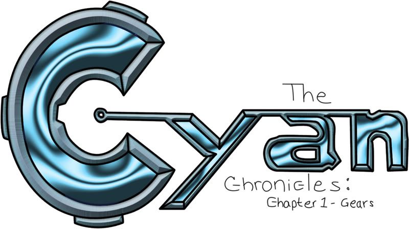
But, before we do, i wanted to throw this file out there for everybody to see.
Posted Image
Here's a photoshop file if anyone wants: http://rapidshare.co...n_Logo.psd.html

Now, this is a logo idea I had. I want to know what you folks think of it. Obviously I stopped colouring halfway through. That's where you guys come in again. I want to know, first, if you think it's worth my time to continue coloring it. Also, I want to know if anyone wants to try their hand at digitlly colouring this as well. I can photoshop, but obviously I'm not the best or a pro by anymeans. So if anyone finds making a logo an interesting task, go for it. You can even make an original one without using this tmeplate. Feel free to use different colours if you wish, but try to keep it in the cyan/blue family. This isn't an urgent task but I thought you guys would like to see this anyway.

Now, plot. Assuming everyone is still ready to work, and is familiar with where we left off, lets continue after the mountains. As we decend the mountain with our newfound partner, Bernard the ice mage, we have no idea where togo. I want to end up in another town near the large tree. Maybe I should upload a map again. Anyway, I need transitioning ideas. Any suggestions?

#165 SnowsilverKat

SnowsilverKat

    OMG ITS A SHINY PSYDUCK

  • Members
  • 1,570 posts
  • Location:The Nutmeg State
  • Gender:Female

Posted 20 January 2009 - 10:08 PM

Looking at that logo...you could probably do some cool stuff with it in Photoshop or Illustrator. I might take a stab at it.

#166 D~N

D~N

    just a humble polymath

  • Members
  • 3,200 posts
  • Gender:Male

Posted 20 January 2009 - 10:16 PM

Yeah, that's where I id all the work on the big "c". Originally it was all pencil. Then I scanned it, fxed the circles to make them eliptical, and coloured very carefully. However, the proess took so long I stopped after the C, hoping someong lse would take an interest in the idea of making a logo - someone with more photoshop skills than i have.

Give it a shot! :) I'd like to see what you can do.

#167 TheAvengerLever

TheAvengerLever

    The Crispin Glover of LA

  • Members
  • 4,105 posts
  • Location:On Youtube.
  • Gender:Male

Posted 20 January 2009 - 10:59 PM

*This is all Avenger's fault.


I just saw this.


HEY BUDDY, I thought I was doing this composing stuff for you? You better BE NICE.


:P

#168 Chiaki

Chiaki

    Quiet Little Pegasus

  • Members
  • 2,538 posts
  • Location:Equestria
  • Gender:Female
  • World

Posted 21 January 2009 - 01:05 AM

I'll take a stab at that logo, too. :)

Um, I think I left off with the Oliver's sketch...I can work some more on that, too, seeing that I don't think we came up with a color palette for him.

#169 SnowsilverKat

SnowsilverKat

    OMG ITS A SHINY PSYDUCK

  • Members
  • 1,570 posts
  • Location:The Nutmeg State
  • Gender:Female

Posted 21 January 2009 - 05:17 PM

Here ya go:

Posted Image

Mind you, this isn't nearly as complicated to do in Photoshop as it looks. I just play with a few Layer Blending Options and then it does all the impressive looking stuff for me. I did the pen tool outlines myself, though.

#170 CID Farwin

CID Farwin

    Disciple

  • Members
  • 2,935 posts
  • Location:At the threshold
  • Gender:Male

Posted 21 January 2009 - 07:10 PM

Wow! That's super-spiffy! Nice job snow!

As for me, I've got a new song-music, but I really liked it, and thought it deserved it's own thread, since I didn't really write it for the game.

here's the thread.

#171 D~N

D~N

    just a humble polymath

  • Members
  • 3,200 posts
  • Gender:Male

Posted 21 January 2009 - 07:15 PM

Here ya go:

Posted Image

Mind you, this isn't nearly as complicated to do in Photoshop as it looks. I just play with a few Layer Blending Options and then it does all the impressive looking stuff for me. I did the pen tool outlines myself, though.


@_@ Holy Crap! This looks so coooool!!! :lol: Wow I love this. Like this looks preffessional.
Seeing this, i cant wait to see what you can come up with, Linkslove!

Button, you know it was your fault. Anything involving buttons is your fault! :P

#172 Steel Samurai

Steel Samurai

    Dragon Lord

  • Members
  • 7,971 posts
  • Location:Los Angeles
  • Gender:Male
  • NATO

Posted 21 January 2009 - 08:23 PM

It's a very early 90s logo. If that's what you're going for, sweet, but otherwise you might want to think about making it less shiny.

#173 D~N

D~N

    just a humble polymath

  • Members
  • 3,200 posts
  • Gender:Male

Posted 21 January 2009 - 08:32 PM

While I don't mind the shininess, I feel that you may be right. That being said, there's some things I want to avoid:
Posted Image
Posted Image
While both great games (well rockband is "okay"), the logos look flat. The simplistic look is nice, but when it's too simplistic it appears boring. I want to avoid boring, but you're right - maybe too shiny.

My suggestion to avoid this isn't to change the colouring though, it's to change the actual font. If we made the borders (the slanted 3D part) thinner, then it may look a little less like a 3d object and a little more like a real font. Then the borders will be more like outlines with slight 3D emphasis than another whole dimmension to the font. Did that make sense?

Edited by D~N, 21 January 2009 - 08:33 PM.


#174 Steel Samurai

Steel Samurai

    Dragon Lord

  • Members
  • 7,971 posts
  • Location:Los Angeles
  • Gender:Male
  • NATO

Posted 21 January 2009 - 08:54 PM

*sigh* You kids and your complexity.

#175 D~N

D~N

    just a humble polymath

  • Members
  • 3,200 posts
  • Gender:Male

Posted 21 January 2009 - 09:14 PM

No no, I know what you mean! I just don't want the logo to turn into a totally flat font. If we were doing a flat font I'd make the logo in Microsoft Word and just up the font size.

#176 wisp

wisp

    Boobie Administrator

  • Admin
  • 14,042 posts
  • Location:in ur base killin ur mans
  • Gender:Knarrarbringa
  • South Georgia and the South Sandwich Islands

Posted 21 January 2009 - 10:09 PM

I like the early '90s shiny look. :P

#177 SnowsilverKat

SnowsilverKat

    OMG ITS A SHINY PSYDUCK

  • Members
  • 1,570 posts
  • Location:The Nutmeg State
  • Gender:Female

Posted 22 January 2009 - 10:17 AM

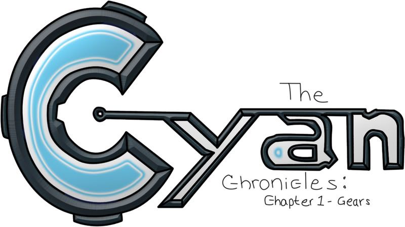
Posted Image

The shiny can be toned down easily. As far as line thickness, I'll have to do some more work on that. Right now this is a Photoshop raster file that I put together just for a little preview of what it could look like. Eventually I'd make a vector file in Illustrator.

For the sake of clarification, raster is a standard image file that made up of pixels, but when you enlarge or shrink it too much you'll get that blockiness and distortion. Vector files don't use pixels, so it can zoomed in without distortion. Also the lines tend to be smoother and crisper and the image itself is much more editable.

#178 D~N

D~N

    just a humble polymath

  • Members
  • 3,200 posts
  • Gender:Male

Posted 22 January 2009 - 10:20 PM

I might like this concept better, if you could keep the colour in the rest of the letters. For example, the y is completely gray on the inside, and the "a" only has a spec of blue. Perhaps a happy medium?

Granted, I liked the first one, but Steel up there had to throw a monkey wrench into everything. :P

#179 TheAvengerLever

TheAvengerLever

    The Crispin Glover of LA

  • Members
  • 4,105 posts
  • Location:On Youtube.
  • Gender:Male

Posted 03 February 2009 - 01:30 PM

Update on Theme Music:


I'm about halfway finished with Vlad's theme, and so far I love it.

I have began work on Oliver's theme, and I love it too.

Here's how I'm going to do this:

Right now I'm thinking I'm just going to write all of these songs as entire suites and then break them down into parts so that you can tinker with which part you'd like to put wherever. Since it's easier for me to write them as suites instead of individual parts so I can get a feel for what I'm doing.

After those are done I'm going to be tackling the main baddies theme, which I already have an outline for. And then of course, the scene-music will be much simpler to operate and it'll come after. I'm sorry these are taking so long, but they are coming along great and I expect to have them done at least soon.

#180 TheAvengerLever

TheAvengerLever

    The Crispin Glover of LA

  • Members
  • 4,105 posts
  • Location:On Youtube.
  • Gender:Male

Posted 03 February 2009 - 01:52 PM

Another Update:

Sorry for the double post, but I do have this thing I wrote for funsies and I thought it worked great as title music, but if you have no use for it that's alright.

Blargh


Copyright © 2025 Zelda Legends