I mean, seriously, "Amerikkka"? You might get fooled by Selena's MilkMaidMalon, but there's no excuse for falling for this.
Edited by Raien, 16 June 2010 - 08:34 AM.

Famicom

Posted 16 June 2010 - 08:34 AM
Edited by Raien, 16 June 2010 - 08:34 AM.
BBBFF
Posted 16 June 2010 - 11:03 AM
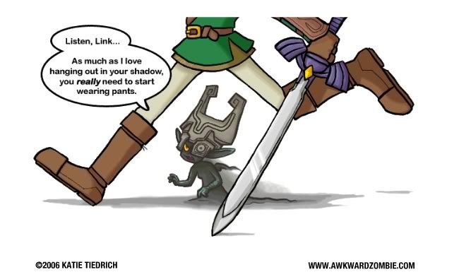
Edit: Elvenlord, Link wears pants in TP. The same exact ones too if I'm not mistaken.

Warrior
Posted 16 June 2010 - 11:40 AM
I was refering to that sword earlier. And the Moblin didn't help. I can just feel Ganon's return. About time as well.
I'm happy with it. The graphics are a nice blend between TP and WW; looks nice! I'll be interested in finding out what the premise is, but hey, its nice to see a Zelda game worth getting a little excited over for a change!
I like it too. I've been waiting for them to marry the too looks ever since TP came out. Though having seen what it looks it does seem a bit awkward looking. The toon look makes sense with young Link because we're suppose to be seeing things through the eyes of a 12 year old. As an adult Link it just makes seem gay...(and I can say that since I am gay, no one else XP). I mean look at him. He looks so pretty! LOL What's worse is taht this is suppose to be the oldest Link has been, older than TP Link. Maybe it was more a young teenage Link like 14 or 13, it'd be more believable. Don't get me wrong, I'm loving this [img]http://forums.legendsalliance.com/public/ALOT.png[/img]! There's only two things I truly hate, the title logo (it just seems to blah). And the HUD. Having a huge transparent wii remote on the screen is way too distracting and takes away from the fantasy feel of the game. What I'm really hyped about is the possibility of getting to explore Hyrule in complete cell-shaded goodness. Something I've been really dying to see ever since they gave us a taste of it in TWW. That would more than make up for Link's pretty pretty PRETTY boy looks.
Pretty. Haha.
Overall, I feel pretty mixed about this. One things for sure, I'm totally surprised. Also, no one's mentioned that Link has the Master Sword in the screen shots. I thought this games was supposed to Master Sword-less till towards the end. Or was that one of the false rumors?
Edit: Elvenlord, Link wears pants in TP. The same exact ones too if I'm not mistaken.
Okay, I don't know who this Picman is but I was never banned from this site.
@ SOAP: How can anyone be confused with Picman? After what I've heard about him, that's a bad thing to mistake someone for. Do I want to know why he was banned anyway?Wait a minute! Picman, weren't you banned?
BSc (Hons) MSc

Posted 16 June 2010 - 01:50 PM
feeesh


Posted 16 June 2010 - 02:13 PM
Look, all I know is that they need to improve the graphics a bit. Link looks rather strange.

BSc (Hons) MSc
Posted 16 June 2010 - 02:23 PM
Odinsdottir

Posted 16 June 2010 - 02:43 PM
The Right Stuff
Posted 16 June 2010 - 03:17 PM
So Oo Ap Puh

Posted 16 June 2010 - 06:20 PM
Multi-talented person

Posted 16 June 2010 - 08:00 PM
Svartifeldr
Posted 16 June 2010 - 08:10 PM
You know, I actually somewhat thought about that. This game seems like what some of the older games would look like if they were in 3D.3) Stepping back and considering the style, I think the general color palette and style are somewhat comparable to LttP, if it had been 3D.
Building consensus...
Posted 16 June 2010 - 08:19 PM
Look, all I know is that they need to improve the graphics a bit. Link looks rather strange.
I'm not sure he does, though - he's not much different that the TP Link:
Honestly, he looks better/more cleaned up to me.
Harbinger of the Fall.

Posted 16 June 2010 - 08:57 PM
Building consensus...
Posted 16 June 2010 - 09:06 PM
just a humble polymath
Posted 16 June 2010 - 11:18 PM
Edited by D~N, 16 June 2010 - 11:23 PM.
Building consensus...
Posted 16 June 2010 - 11:41 PM
Boobie Administrator

Posted 16 June 2010 - 11:49 PM

Harbinger of the Fall.
Posted 17 June 2010 - 12:35 AM
Compare these:
Spoiler
And these:Spoiler
=/
Now, something I DO like about this game is the new official art! Check this out!Spoiler
I think it's obvious that link is younger than TP link here.

Novice

Posted 17 June 2010 - 01:35 AM
Follow the smoke; find the fire.

Posted 17 June 2010 - 08:01 AM
Well, to return to the original topic,
I've watched two versions of the trailer on Youtube. Here are some observations thus far:
1) The doglike moblins have returned! Yay!
2) The graphics will doubtlessly improve by the time Skyward Sword (shall we abbreviate it SS?) is released, so I'm not worried on that front.
3) Stepping back and considering the style, I think the general color palette and style are somewhat comparable to LttP, if it had been 3D.
4) What's with the Deku Scrubs (If that's what they are)? They look really ugly, and the stubby tentacles are reminiscent of Octoroks.
5) Like the scorpion boss!
just a humble polymath
Posted 17 June 2010 - 10:12 AM
And you hate the SS look..? I still don't get it...
 I thought it would speak for itself...
 Edited by D~N, 17 June 2010 - 10:21 AM.
The Crispin Glover of LA

Posted 17 June 2010 - 12:04 PM
BSc (Hons) MSc
Posted 17 June 2010 - 02:31 PM
The Great Debate still rages on: Cel-shaded, or epic/realism?
Zelda games: dividing their own fan community several titles at a time.
Edited by Wolf O'Donnell, 17 June 2010 - 02:32 PM.
Harbinger of the Fall.
Posted 17 June 2010 - 08:51 PM
And you hate the SS look..? I still don't get it...
...well yeah. It looks like some of the trees came right out of Mario 64. Which would be fine if the style was interesting and detailed, but no, when I mean Mario 64, I mean pixelated and flat, too. This style is fine; after all, I loved it in TWW. But just like PH and ST on the handhelds, something about this cell-shading just makes me fee like they're doing it wrong. Cell shading is a brilliant style choice because you can smooth out edges and create a detail-less world that still looks asthetically pleasing. But there inlies the rub; they're trying to blend TP, a style with details, and TWW, a style without them, and what they get is a world where trees are soft and pastel colored, which would be fine, but then they try to add details and it just falls to pieces.
The whole point of TWW is to play to the Wii's stengths. Trying to compromise it with TP is foolish. Picking one or the other would have been wiser, because there styles are two different to try and blend, I feel. I hope they prove me wrong or the style grows on me over time, because I really think they did a poor job. Mario Galaxy 2 proved that cell-shading can look amazing on the Wii. TP proved that realistic graphics can look spectacular on the Gamecube! This, however...I mean, just look at some of the trees!
I guess it just speaks to the kind of art I like. I enjoy whatever you'd call the WW's style every now and again. I really do. But my true favorite art style is sublimity. Epic backdrops, huge fields...basically TP. And now I guess I feel like the cell-shading is contaminating my favorite style, so to speak. It's a filter I would rather not have. It's also a lingering dissapointment after they promised us the darkest Zelda game yet, with the most mature Link, etc. And that one picture they revealed made me certain we'd be getting a sublime style. If we weren't told that in the first place, I might not be as agitated as I am now.
So Oo Ap Puh
Posted 17 June 2010 - 09:25 PM
And you hate the SS look..? I still don't get it...
...well yeah. It looks like some of the trees came right out of Mario 64. Which would be fine if the style was interesting and detailed, but no, when I mean Mario 64, I mean pixelated and flat, too. This style is fine; after all, I loved it in TWW. But just like PH and ST on the handhelds, something about this cell-shading just makes me fee like they're doing it wrong. Cell shading is a brilliant style choice because you can smooth out edges and create a detail-less world that still looks asthetically pleasing. But there inlies the rub; they're trying to blend TP, a style with details, and TWW, a style without them, and what they get is a world where trees are soft and pastel colored, which would be fine, but then they try to add details and it just falls to pieces.
The whole point of TWW is to play to the Wii's stengths. Trying to compromise it with TP is foolish. Picking one or the other would have been wiser, because there styles are two different to try and blend, I feel. I hope they prove me wrong or the style grows on me over time, because I really think they did a poor job. Mario Galaxy 2 proved that cell-shading can look amazing on the Wii. TP proved that realistic graphics can look spectacular on the Gamecube! This, however...I mean, just look at some of the trees!
I guess it just speaks to the kind of art I like. I enjoy whatever you'd call the WW's style every now and again. I really do. But my true favorite art style is sublimity. Epic backdrops, huge fields...basically TP. And now I guess I feel like the cell-shading is contaminating my favorite style, so to speak. It's a filter I would rather not have. It's also a lingering dissapointment after they promised us the darkest Zelda game yet, with the most mature Link, etc. And that one picture they revealed made me certain we'd be getting a sublime style. If we weren't told that in the first place, I might not be as agitated as I am now.
From what I've seen it doesn't look all that bad at all. And nothing says that a bright art style would clash with dark game play. Have you played Persona 3? Persona 3 is a Shin Megami Tensei game. Shin Megami Tensei games are renowned for their really dark subject matter. Persona 3 was a cel shaded game. Sure it's not as extreme and cartoonish as what has been shown for Skyward Sword, but to assume the art style will negatively impact the storyline is something that can not be accurately accounted for until the game debuts. Also there is nothing out there that says cel shading isn't allowed to be detailed.
But I personally always seem to be able to be completely open minded when it comes to radical new changes in artistic direction.
Edited by SOAP, 17 June 2010 - 09:44 PM.
Harbinger of the Fall.
Posted 17 June 2010 - 10:52 PM
It's also a lingering dissapointment after they promised us the darkest Zelda game yet, with the most mature Link, etc.
So Oo Ap Puh
Posted 17 June 2010 - 11:28 PM
Building consensus...
Posted 17 June 2010 - 11:51 PM
The Crispin Glover of LA
Posted 18 June 2010 - 12:50 AM


 Copyright © 2026 Zelda Legends


