Jump to content

IPBoard Styles©Fisana

Photo

practice...


  • Please log in to reply
62 replies to this topic

#31 Nabooru

Nabooru

    Master

  • Members
  • 764 posts
  • Location:Ohio
  • Gender:Female

Posted 29 June 2005 - 12:41 PM

Photobucket is a free image hosting service, www.photobucket.com, and is very effficient. That's what I use. ^_^

#32 Zythe

Zythe

    Beginner

  • Banned
  • 1 posts

Posted 29 June 2005 - 12:41 PM

I don't use layers in my banners either.  I haven't found the layering function in my program yet.  XD


Really? You don't know what you're missing! So you're doing everything in stages, in the order you want it to appear?

My god.

You'd be unstoppable with Photoshop.

#33 D~N

D~N

    just a humble polymath

  • Members
  • 3,200 posts
  • Gender:Male

Posted 29 June 2005 - 01:15 PM

Posted Image

a new one. used 5 layers (yay) it wasn't very hard.

#34 D~N

D~N

    just a humble polymath

  • Members
  • 3,200 posts
  • Gender:Male

Posted 29 June 2005 - 09:33 PM

sorry about the double post again, but it is something new.
Posted Image
just 3 layers, easiy to make.

#35 Goth Kirby

Goth Kirby

    Archer

  • Banned
  • 212 posts

Posted 30 June 2005 - 04:21 AM

lovin the "comin' at ya" banner, really nice

#36 Nevermind

Nevermind

    Building consensus...

  • Members
  • 9,417 posts
  • Gender:Not Telling

Posted 30 June 2005 - 08:00 AM

What program are you using, Nabooru?

#37 Ero

Ero

    Bard

  • Members
  • 59 posts

Posted 30 June 2005 - 09:40 AM

Nabooru uses Ulead PhotoImpact 7, and shes damn good with it. :)

#38 Nevermind

Nevermind

    Building consensus...

  • Members
  • 9,417 posts
  • Gender:Not Telling

Posted 30 June 2005 - 10:13 AM

Yeah I can tell. My uncle uses that for his website images. I was pretty sure he used layers with it.

#39 Nabooru

Nabooru

    Master

  • Members
  • 764 posts
  • Location:Ohio
  • Gender:Female

Posted 30 June 2005 - 11:06 AM

hehe thanks guys. ^_^ Someday I will find the layer function. :nnsweat:

BTW DN, nice work on the banners! You are improving with every banner you make! I like the picture choices and positions you use on them. They tie in with the text quite well.

#40 D~N

D~N

    just a humble polymath

  • Members
  • 3,200 posts
  • Gender:Male

Posted 30 June 2005 - 04:47 PM

~thank you, nab and goth kirby! i just finised this one:
Posted Image
I like it a lot, what do you think?

#41 Nevermind

Nevermind

    Building consensus...

  • Members
  • 9,417 posts
  • Gender:Not Telling

Posted 30 June 2005 - 07:15 PM

I like the style. Just one thing, see if you can make those bullets more like balls of light so it doesn't look quite so much like she's firing caramel chew drops at them XD

#42 Sephrenia Katrov

Sephrenia Katrov

    Muted Muse

  • Members
  • 2,126 posts
  • Location:Birmingham ;_;
  • Gender:Female
  • South Korea

Posted 30 June 2005 - 07:24 PM

I like the style of the last one... looks far more professional. ^^;

#43 D~N

D~N

    just a humble polymath

  • Members
  • 3,200 posts
  • Gender:Male

Posted 30 June 2005 - 07:44 PM

thank you (and lol to laz)
is this one better laz?
Posted Image

#44 Nevermind

Nevermind

    Building consensus...

  • Members
  • 9,417 posts
  • Gender:Not Telling

Posted 30 June 2005 - 08:20 PM

Well, sorry to be picky, but now they like propelled chew drops XD

However, on a serious note, they do look [img]http://forums.legendsalliance.com/public/ALOT.png[/img] better. Try giving them an inner glow in the blending options, OR you can try some effects with the hue/saturation and brightness/contrast adjustments. If you bring your contrast up, it gets brighter and brighter but this looks dodgy on its own. So you then bring your saturation down a little, bring the lightness up a little, and then go back and adjust your contrast up a bit, then add some smudges if you'd like. You can just keep doing this however you like to fine tune your settings. It'd be [img]http://forums.legendsalliance.com/public/ALOT.png[/img] easier for you working the psd file, but here's what I mean.

Posted Image

You can also add an outer glow maybe for more effects, but if you do, do it AFTER you smudge, otherwise you'll just have all this glow sitting out the back.

#45 D~N

D~N

    just a humble polymath

  • Members
  • 3,200 posts
  • Gender:Male

Posted 30 June 2005 - 08:38 PM

thanks, much better than mine looked! here's what mine turned out to be, and a new one:
Posted Image

Posted Image

i did the link thing to practice layers, mostly....

#46 Zythe

Zythe

    Beginner

  • Banned
  • 1 posts

Posted 01 July 2005 - 09:38 AM

I'm really impressed by the fireballs. Did you make them in photoshop or get them from somewhere? EDIT: You need to change the trajectory of the bullets. Use a line tool coming from Samus' beam gun and free transform the bullet layer so it matches up better.

#47 D~N

D~N

    just a humble polymath

  • Members
  • 3,200 posts
  • Gender:Male

Posted 01 July 2005 - 05:32 PM

if i transform the bullets, there is a blank space, so i can't do it. However, i made a new one:
Posted Image
simple to make, and it came out decent, you think?

#48 Zythe

Zythe

    Beginner

  • Banned
  • 1 posts

Posted 01 July 2005 - 06:34 PM

Very nice. Maybe you could have lowered the opacity on Zelda so you could see the writing underneath her, or set the layer so she was opaque in parts and translucent in others, so match the text... then you could duplicate that layer and set it to something else that looks nice and then lower the opacity on that so you get a nice effect and can see the writing.

You're getting a lot better.

#49 D~N

D~N

    just a humble polymath

  • Members
  • 3,200 posts
  • Gender:Male

Posted 01 July 2005 - 06:49 PM

thank you zythe! this was the best i could do. Meh.
Posted Image
I'll try another soon. What should i do? ( I just love doing these!)

#50 Zythe

Zythe

    Beginner

  • Banned
  • 1 posts

Posted 01 July 2005 - 06:51 PM

Even that's a big improvement. I think you should try being bolder now... how about making backgrounds or modding images?

#51 Ero

Ero

    Bard

  • Members
  • 59 posts

Posted 01 July 2005 - 06:59 PM

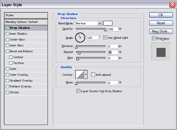
For that Zelda sig, if you have a blending options screen, then on the "The Legend of Zelda" text do this:

Posted Image

Should help the text show up a bit more.

#52 D~N

D~N

    just a humble polymath

  • Members
  • 3,200 posts
  • Gender:Male

Posted 01 July 2005 - 07:20 PM

XP don't got one of those XP
did what zythe told me. came out with this. was fun to make:
Posted Image
I have to fix my sig. This should be fun.....

#53 D~N

D~N

    just a humble polymath

  • Members
  • 3,200 posts
  • Gender:Male

Posted 01 July 2005 - 08:45 PM

sorry about the double post again, but it is something new....again.
Posted Image
i had to remake my sig (added kirby) because apparently "Miyamoto" didn't make metroid. phooey. well, there it is.

#54 Zythe

Zythe

    Beginner

  • Banned
  • 1 posts

Posted 02 July 2005 - 09:21 AM

Oooh. We have to do something wth the text, though. Try setting it to difference of in white if you haven't any glow options.

#55 D~N

D~N

    just a humble polymath

  • Members
  • 3,200 posts
  • Gender:Male

Posted 02 July 2005 - 09:47 AM

for which one, background or banner?

#56 Zythe

Zythe

    Beginner

  • Banned
  • 1 posts

Posted 02 July 2005 - 10:14 AM

Both. And they're both amazing.

#57 D~N

D~N

    just a humble polymath

  • Members
  • 3,200 posts
  • Gender:Male

Posted 02 July 2005 - 05:44 PM

thanks. unfortunately, i forgot to save it as a phtsp or whatever, and instead used jpeg. However, i made this, sorry about the jpeg thing though :(
(i'm in a kirby mood lately):
Posted Image
EDIT: new sig, how is it?
Posted Image

#58 D~N

D~N

    just a humble polymath

  • Members
  • 3,200 posts
  • Gender:Male

Posted 03 July 2005 - 09:40 AM

NEW AVATAR!
Posted Image
sorry about all these double posts, but it's better than a tripple EDIT ;)

#59 Zythe

Zythe

    Beginner

  • Banned
  • 1 posts

Posted 03 July 2005 - 10:00 AM

Banner: good. Just ... the text is weird.

Avatar: good but too dark.

#60 D~N

D~N

    just a humble polymath

  • Members
  • 3,200 posts
  • Gender:Male

Posted 03 July 2005 - 11:02 AM

oh, i blurred the text. it looked WIERDER without the blur.
here's the ava, but lighter.
Posted Image
it got blurred, unfortunately. i hope it looks okay XP


Copyright © 2025 Zelda Legends